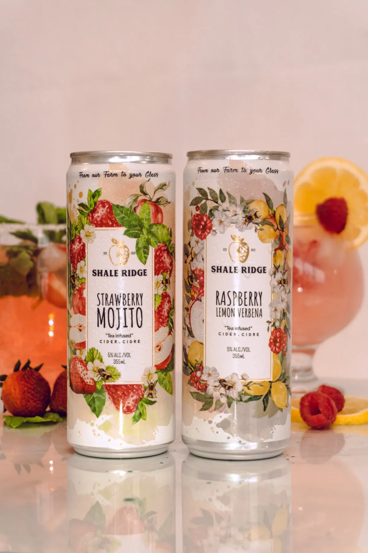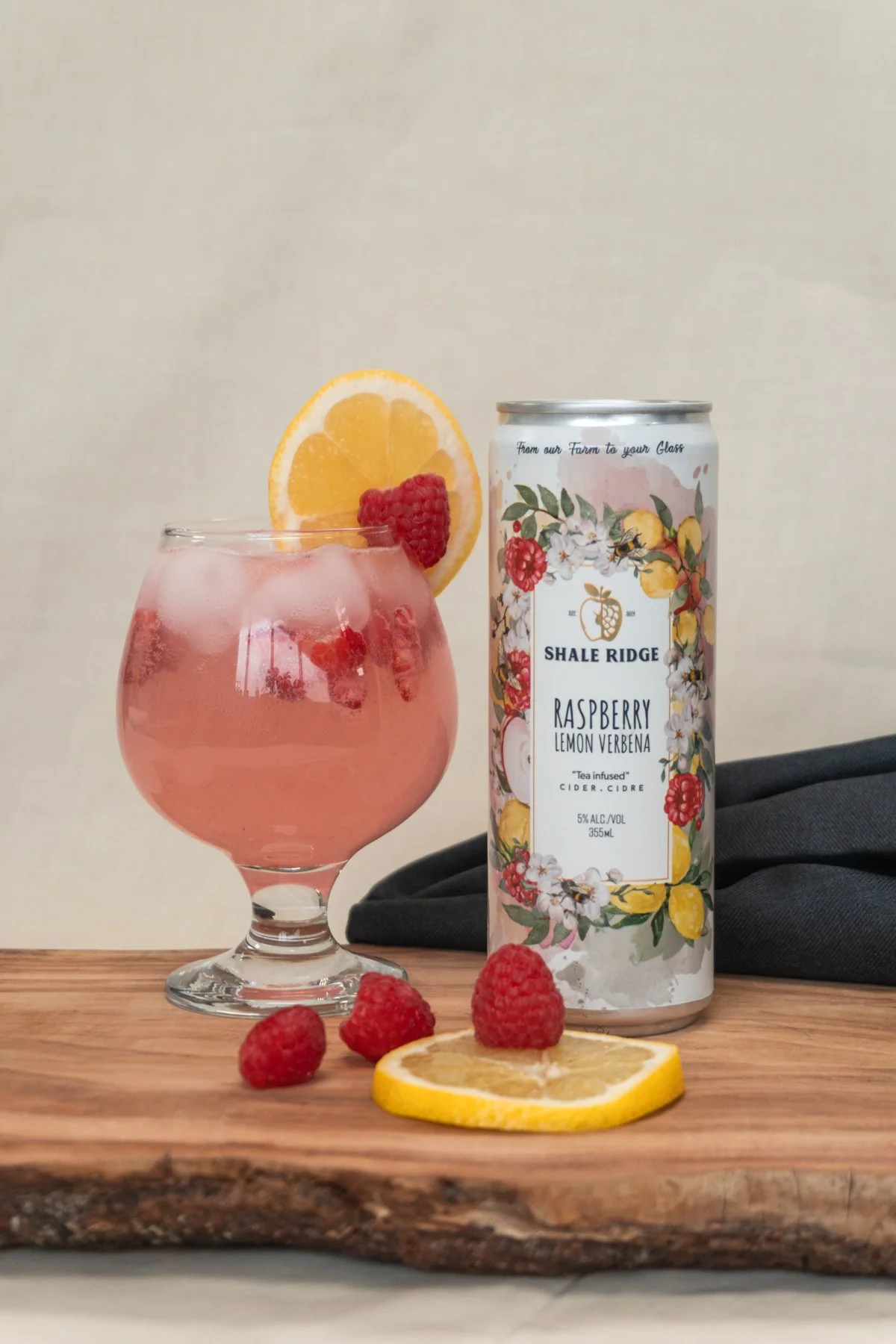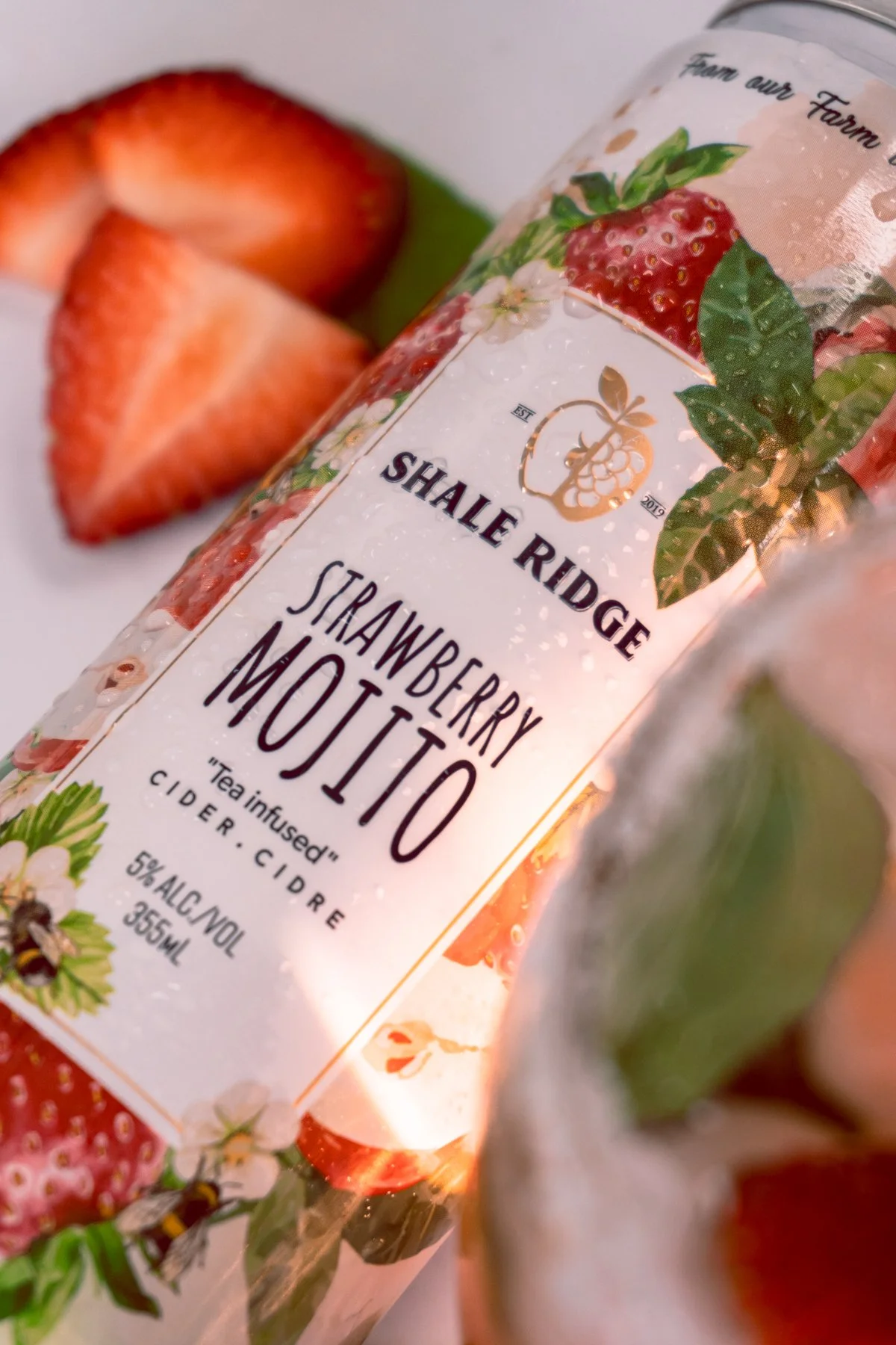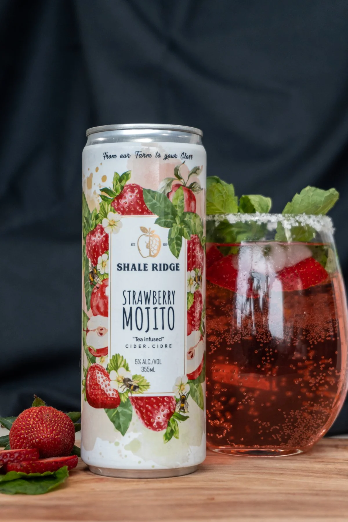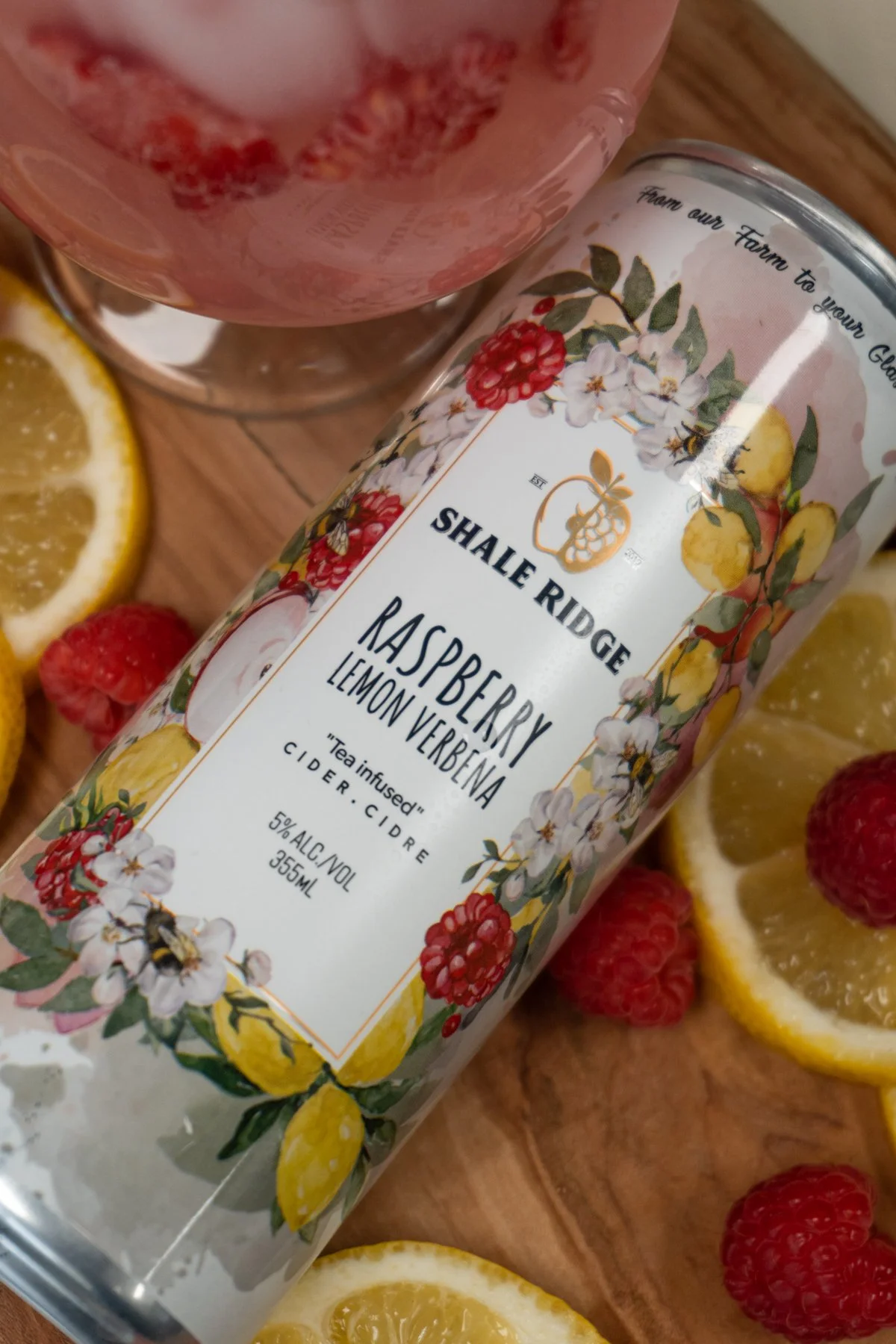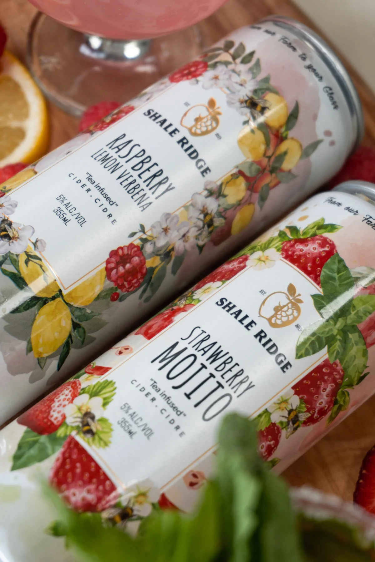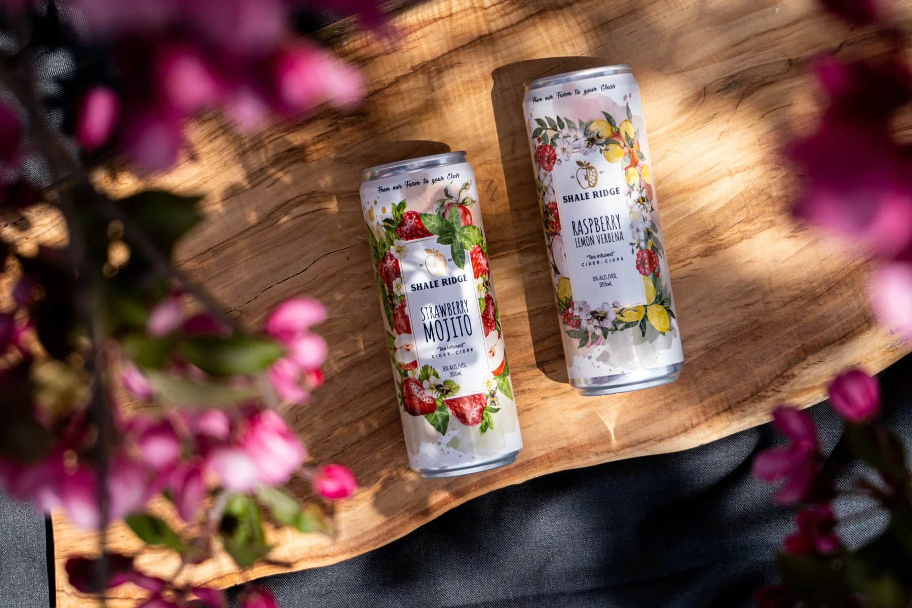
Art direction & design for a Cider Company.
Shale Ridge developed a new product line of cider and needed a new look for their packaging. Keeping within the same style of branding they currently had, I created a new line for their two new cider products. Their target audience was females in their 20s-40s who enjoy good cider and good times. They wanted fresh, bright and a flavourful looking design to draw the consumers in. With the use of illustrations, colour, typography, and printing embellishments I was able to create exactly what Shale Ridge was hoping for!